

How to choose a Data Visualization tool for a Web project?
Published :
15 Mar 2022
Updated :
8 Sept 2025
7min
This is a case study that might be useful for teams deciding which tools they need to build Data Vizs in Web static projects.

This is a case study that might be useful for teams deciding which tools they need to build Data Vizs in Web static projects.
When I started working in the the main challenge was the following: To obtain actionable insights for companies and the Tech community out of the largest platform of freelancers in France . Some numbers: a database of 40K tech freelancers, 93K companies and 303K searches/month. Though my focus was to work in the data analysis, an equally important task was to find a way of visualizing information for the Web/Mobile version of the report.

From the start, I wrote down as a not-to-forget notes some key points to remember while implementing the Vizs.
The main constraint here was also time . We wanted to release by the beginning of December. So, What Viz tool should I choose?
Javascript libraries are the most popular tools to create visualizations for the Web. They are always an added value to an interactive Web design. Additionally, some of them are suited to work with front-end frameworks ( Vue.js , React.js …) which makes them specially interesting due to the popularity of frameworks these days. Every year, bloggers publish rankings of trending JS libraries .In a high position in many of them usually appears D3.js .
Created by a former New York Times Data Viz journalist, D3.js excels as the main JS visualization tool thanks to the control that it offers over DOM elements, its capabilities to create different types of SVG paths and a bunch of functions to control animations in graphical elements.

There are some posts questioning D3.js (arguing that the learning curve is difficult, which I partially agree, and providing vanilla CSS and HTML alternatives). In the post above there is a comment made by Jose Antonio Cabañeros Blanco that perfectly summarizes why D3.js is still necessary : “ when you need visualisations more complete, interactive, dynamic and above all, visualisations out of common charts […] nowadays, D3 hasn’t got competition with any other ”. Mike Bostock closes this thread by showing the flexibility that it offers at the time of managing scales, using math functions, and drawing complex SVG paths.

All in all, to choose a Data Viz tool consider what are the Data Viz capabilities of your team ( expertise and available workforce), deadlines limitations, and magnitude of the assignment ( number of Vizs, “out of the box” Vizs to develop…)
After discarding D3.js for this project I compared different free JS libraries : Chart.js, Echarts.js, apexcharts.js… Finally the chosen one was Echarts.js. But….
Interactive and Resizable : All the graphs are automatically resized to suit different browser sizes. Most of them, are also great to be displayed in mobile.
Variety of HTML layouts : One of the most important factors at the time of choosing this library was the amount of available layouts (Scatter plots, Sankey Graphs, Radar, Geo vizs … and even 3D modelings).
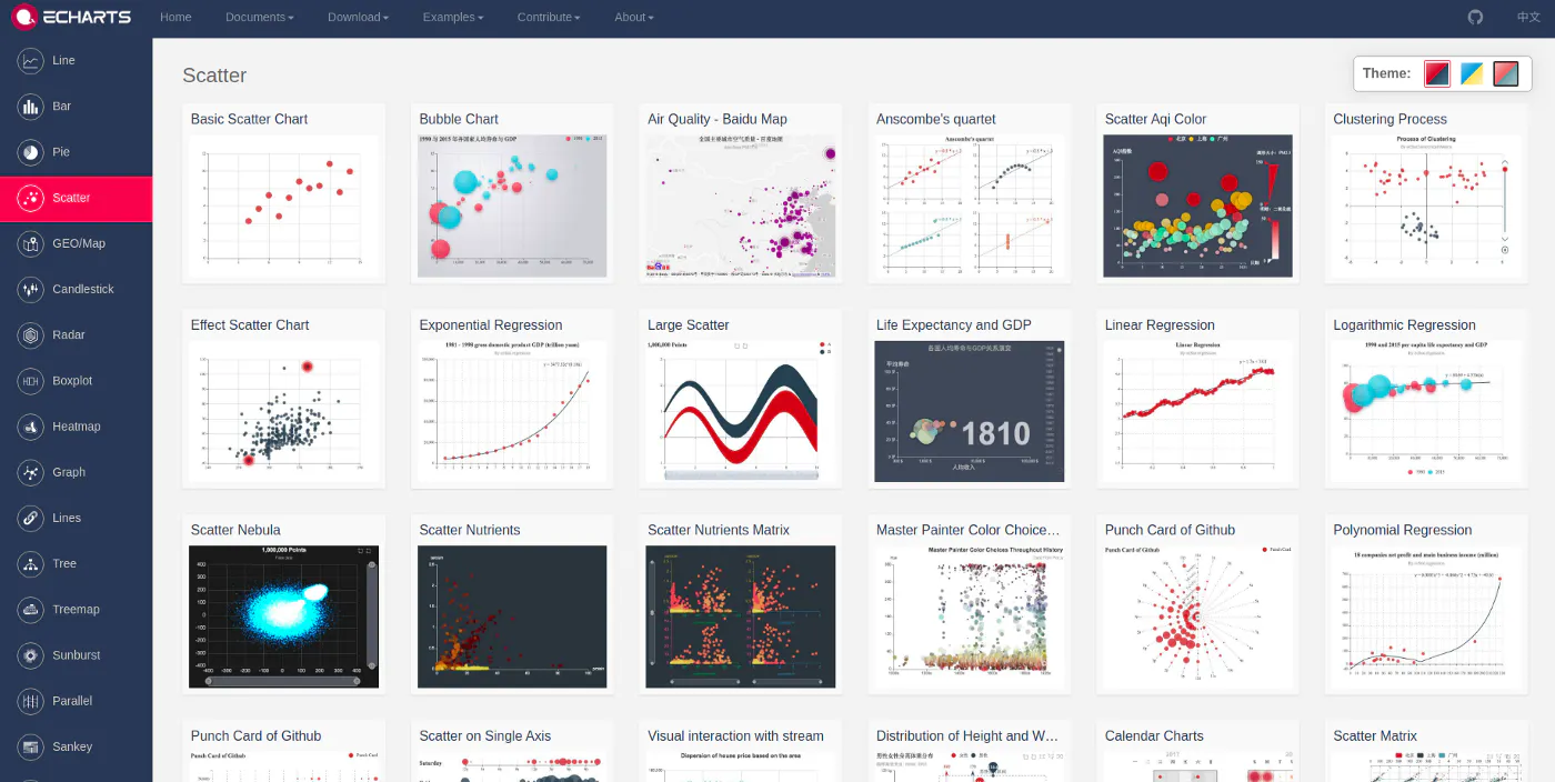
3. Customization : If you are skilled with Javascript Viz you will find easy to combine different graphs, tweak the designs and ease the creation of the Vizs.

2. It is a "high level" visualization tool. What I mean with this is that the lack of direct control of all the graphic elements could be a burden at the time of customizing some graphs. This is a key concern at the time of implementing designer's feedback to imprint a strong brand identity to the Vizs.
3. You might not find all the layouts that you seek to visually convey your message. A limitation you will always find using these “ higher level ” JS libraries (comparing them with D3.js) is that at some point the “ party is over ”: You have what you have. This points bring me to the next section. If you don’t find what you look for, just use other Data Viz tools. “Taste the variety” as we say in Spain.
As a second tool, I decided to use a data Viz platform called Flourish. It allows non coders to create beautiful graphs and storytelling animations.

Time efficiency: It can take you literally 30 seconds to create a graph.
Storytelling capabilities: There are really nice animated features designed. Look at this examples on their website . Soon in Malt we will explore storytelling options thoroughly!!
HTML export: You can export Vizs to HTML, so adding some basics HTML skills on top you can easily add them to your Web.
Don’t think about using it for to build Vizs in Dynamic Websites. Data is plugged in the HTML and it would be truly challenging to build a data pipeline to import the data (even imports from CSV/JSON files is challenging).
To implement design inputs outside of the available options in the menu of edition you have to dive in the HTML to find how to tune parameters. Some changes might actually take more time than creating from scratch the same Viz in D3.js.
That’s it. That’s how I built the Data Vizs in the Malt Data Report. And here it is the end result.

This is a Malt Case study. It targets teams facing similar Data Viz decision making.